| Date | August 2021 |
| Roles | UX Design and Research, Branding, UI Design |
| Tools | Adobe Suite, Google Suite, Figma |
| Deliverables | Case Study Slide Deck, Brand Guidelines, Interactive Prototype |
| Date | August 2021 |
| Roles | UX Design and Research, Branding, UI Design |
| Tools | Adobe Suite, Google Suite, Figma |
| Deliverables | Case Study Slide Deck, Brand Guidelines, Interactive Prototype |
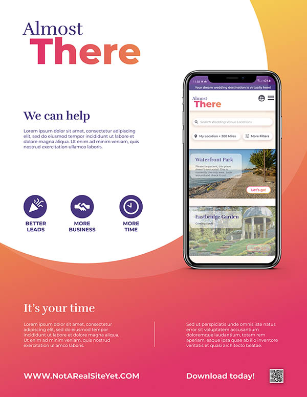
For Google’s UX Certification I was tasked with creating an app that allows users to take a virtual tour of a wedding venue. After researching and getting in the headspace of people who might use such an app, the idea quickly evolved. The app could be not only a platform or open market for wedding venue locations to allowing patrons to take a virtual tour and see their spaces, but it could also let users customize and set up the area virtually to preview the space with decorations and furnishings.
I talked to several people during an initial series interviews to gauge interest and find out about their experiences with existing interfaces. I drew on common conventions “How do you feel about picture-based tours, like realtor listings? Or video tours, like the Travel Channel? Finally a 360 image tour like Google Street View?”. All participants seemed in agreement that a 360 panoramic solution would be a familiar and usable interface, a language they already understood right off the bat. A few suggested a guided sort of tour or some sort of voiceover or leading elements but all wanted to be able to switch to self guided instantly.
Most importantly more than half expressed that they’d like a way to see a preview of different setups, seating arrangements, and decorative elements. This was entirely outside of the scope! This was something I hadn’t even considered! This was... a real good idea that could add an entire additional layer of usefulness to the concept, and became a key feature.
What if an app could cut out at least one trip driving to a location, perhaps multiple trips with friends and family, to have a stranger guide you around potentially with a sales pitch? Or what about being able to check out a distant destination wedding locations on your couch?
So with the idea coming into focus, I did some research on what was already out there and what was technically possible. Matterport is an interesting approach and appears to be the “gold standard” of 3d tours. But our decoration and customization feature didn’t seem possible there.
Once I realized that "open source web based 360 panoramic image viewer" was the magic incantation to type into Google, I found that this wheel had already been invented as I hoped. I reviewed a handful of these results, Pannellum was nice and a close second, but ultimately Marzipano would win as the best way to make a fully-functional prototype beyond Figma. Marzipano is open source and an active/not dead project, and had 2 different potential ways to achieve the technical feat of having multiple customizable decorative elements by either swapping out transparent layers of images dynamically or even rendering 3d objects.
Two distinct personas were devised to help bring two different use cases to the forefront. A primary user planning a wedding and wanting to select customizations, and a secondary user group (friends or family) that would want to see the customized venue and give feedback. You can meet Jemma and Troy in the slide deck if you’d like, and read more there.
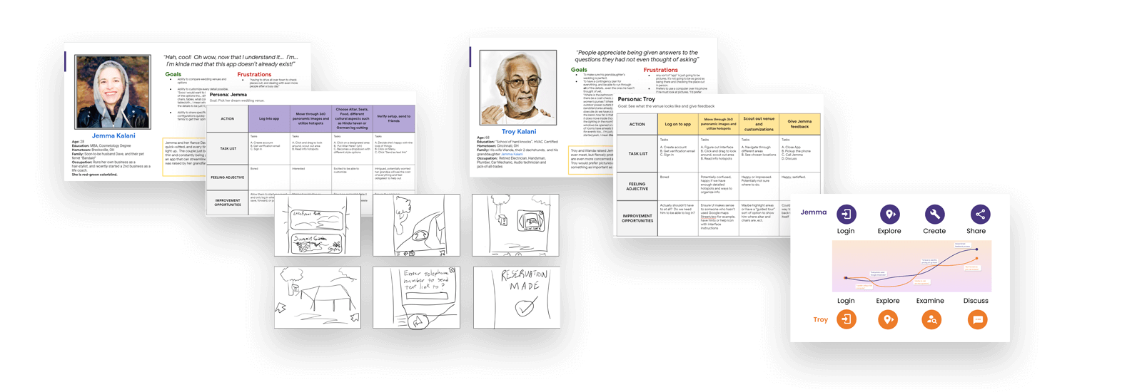
Compiling and understanding these user personas, journey maps, and user flow diagrams uncovered more insights. Wedding ceremonies are steeped in rich culture and history. What if someone wanted a Hindu homa, a German log cutting ceremony, or any one of thousands of different configurations that the venue had not thought of but would be able to provide or allow? Being able to select "other" or "custom" or upload a picture for visualization made sense.
Our foundational interviewees had stated they would like to see the price of everything up front, but wouldn’t primary users want the option to have it not show the pricing within their shared URL? Uncle Troy is always offering to help pay for things anyways, and we could already hear aunt Wanda gasping aloud at how much we were going to pay... nobody had time for that sort of drama, so some sort of privacy settings would be a necessity.
Next I started visualizing and sketching out rough ideas of what the interface and iconography could look like.
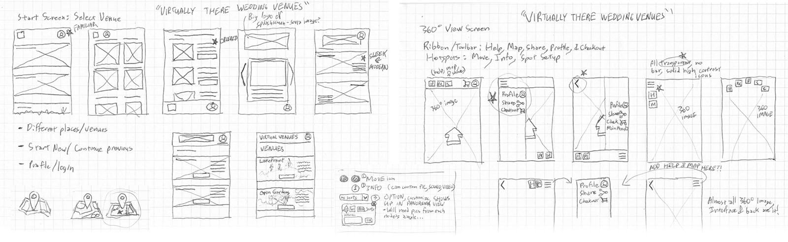
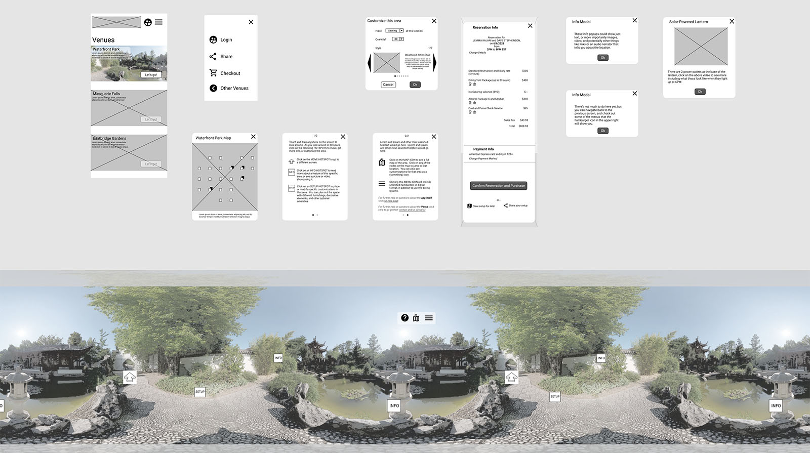
Those sketches grew into wireframes, and a barebones workable prototype emerged. A good portion of the app would be modal windows so I drafted wireframes for those as well.
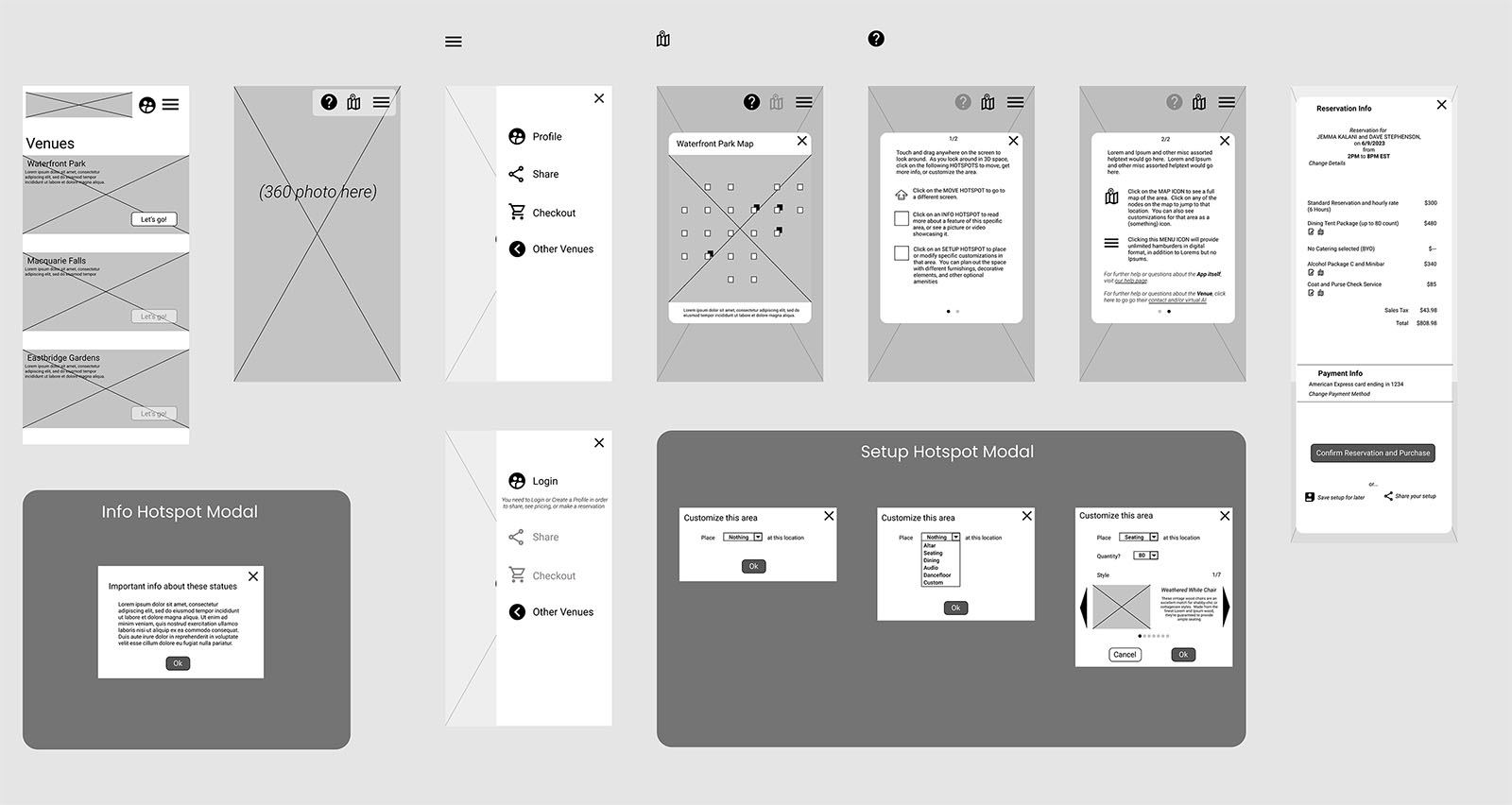
2 test 360° HDRI panoramas within Figma were lined up end to end so that they could be dragged around, and would eventually loop back to the beginning, to make up the mock 3D effect.
Now armed with a semi-functional prototype I ran a moderated study where users were tasked with completing a few interactions, then featuring some questions relating to experiences and opinion of the product. More than one user struggled with understanding the concept due to the low fidelity. One remarked "I don't understand why it's in black and white?" and another "I can't picture actually being able to fit that many chairs there, so I didn't think that was the right spot." I learned that the more "off the beaten path" the interface goes, the more fully fleshed out the prototype needs to be for a valid test. Given the opportunity I would have taken my own 360 photos or make a much more 'dense' prototype with many more closely connected images.
This study did yield some helpful ideas - additional new screens were added to give users a central page of commonly asked questions, and provide multiple ways to reach out for additional information or requests that weren’t covered there or in the info modals. Ultimately this could be connected to an AI assistant that could help field the first line of questions.
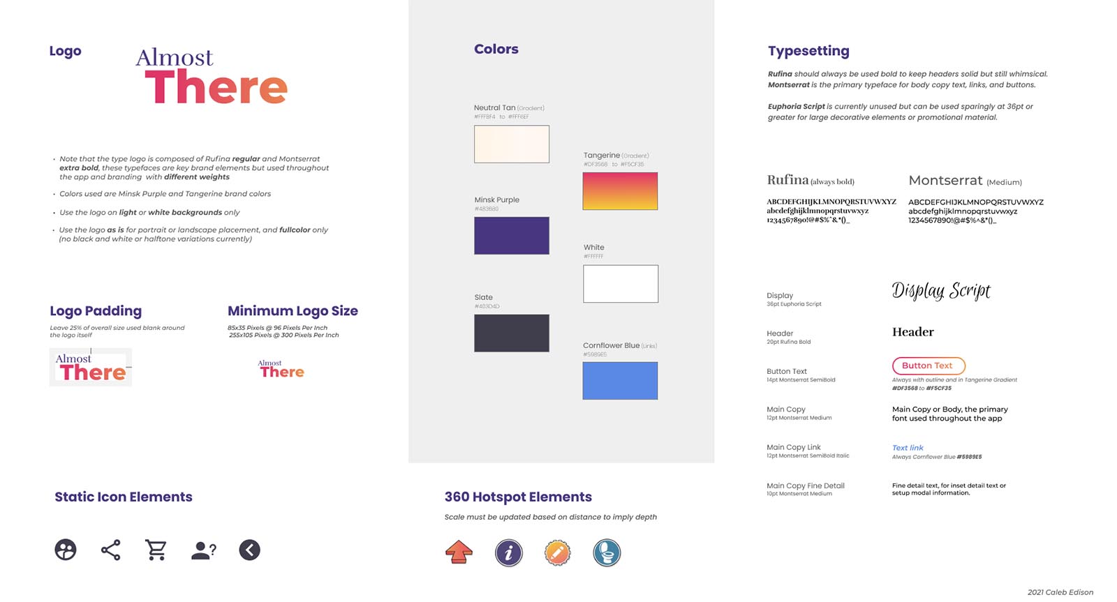
I settled on a deep purple and a complementary gradient as a color scheme to keep the interface and brand in general bright, active, and inspiring. I'd also been testing out fonts and settled on a pair that meshed right. A name was pinned down, and typographic logo drawn up.
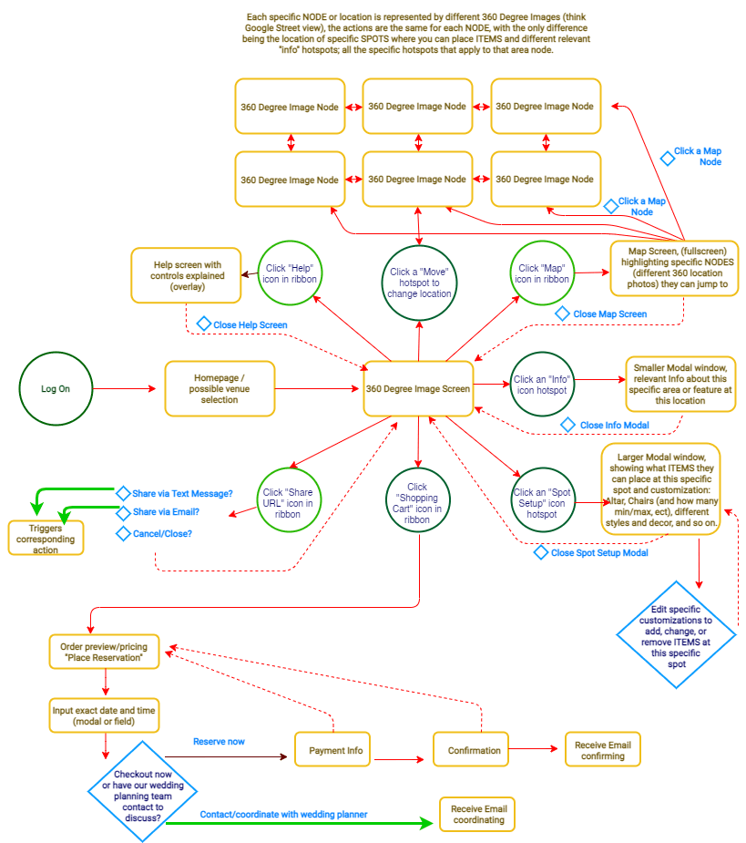
Below is a full map of the prototype itself. However, you can also check out the Interactive Prototype and take a look yourself. Keep in mind that due to technical limitations this is still just enough to get the idea across, a workable prototype with real hotswapping of decorative elements would need to be done in Marzipano or something similar.
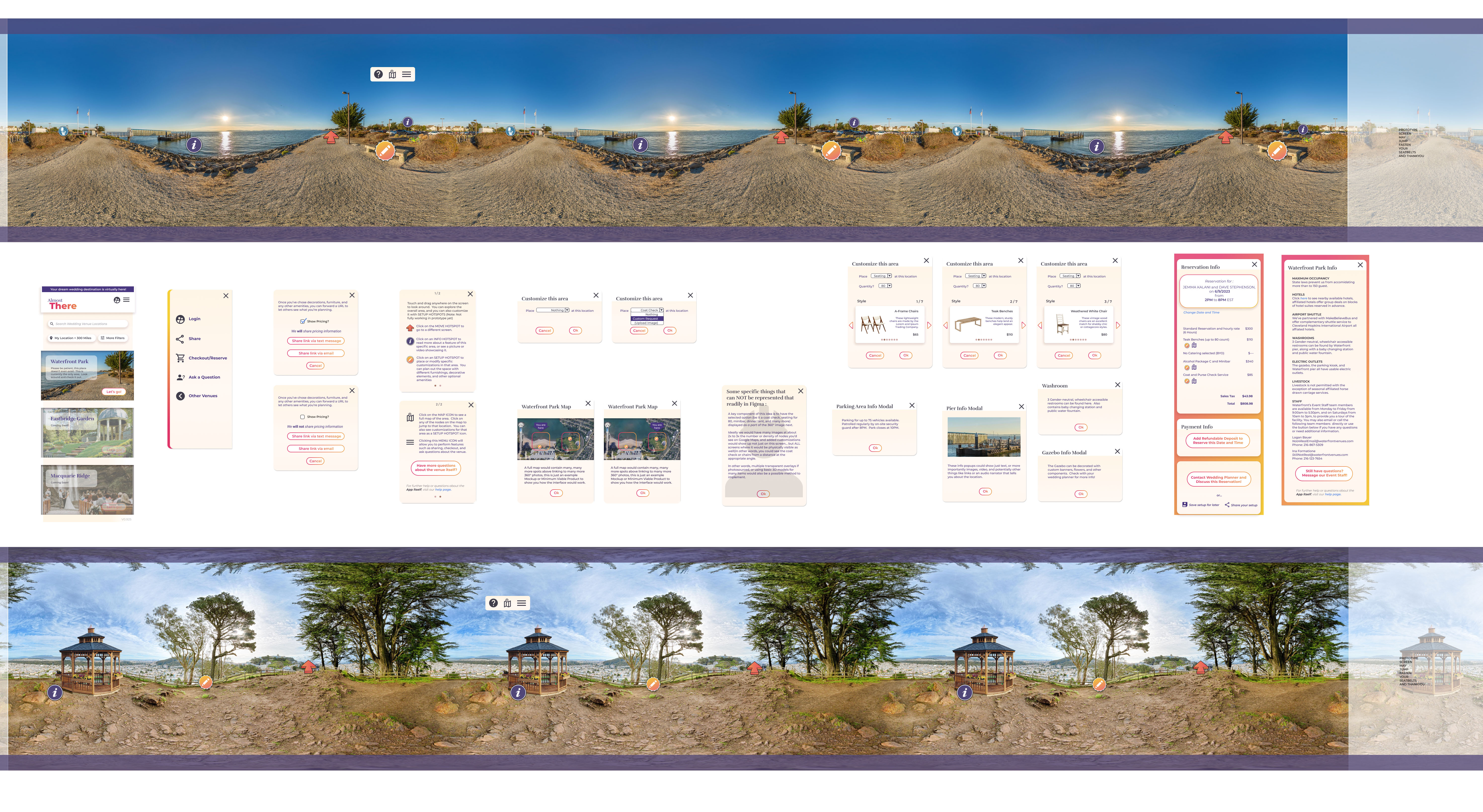
Next, twenty humans participated remotely in a second unmoderated study with the revised high-fidelity prototype. This study took place via a really helpful integration called Maze, which plugged directly into Figma so that the testing process could be fully automated. This really changed the playing field, and I can't state enough how impressed I was with Maze.
At the end of the day this round of testing ultimately didn’t yield too much new helpful data, one user did note that having specific icons for things like restrooms could make sense. The test did show significantly better results as far as usability - 75% of users completed all the requested tasks within the target timeframes(under a minute total to find the gazebo and then click on any setup hotspot), while 10% seemed engrossed in systemtically exploring all of the functions of the app.
The response to the initial idea was overwhelmingly positive. I was suprised how much people want streamlined experiences like this, and are eager to try them out. This project also showed me how helpful initial user research can be, the customization and decoration feature that multiple users alluded to quickly proved to be the most novel and useful feature. I also was impressed with how once the fidelity of the prototype was built out enough people could easily see and intuit not only the universal language of icons, but how to “look around” by touching and dragging and jump right into interacting with a panoramic image. A 'pinch to zoom' feature would just be common sense now, for example.
In order to stay within the project scope I focused on weddings, but expanding the app to any rentable event space would be worth pursuiting. Building a full-featured prototype is a huge next logical step, as is narrowing down the best ways to monitize the app. Partnering with venues would be a good way to start this, and while initially it could be a free service or add supported, having venues actually pay a small fee to list could be considered.
One business owner interviewed made a great point, stating that they put a good deal of time and effort into scheduling and meeting with clients who don’t end up becoming customers, that they would gladly pay to list their location if it meant that the “easy questions” could be automatically answered for them and they would get more qualified leads.