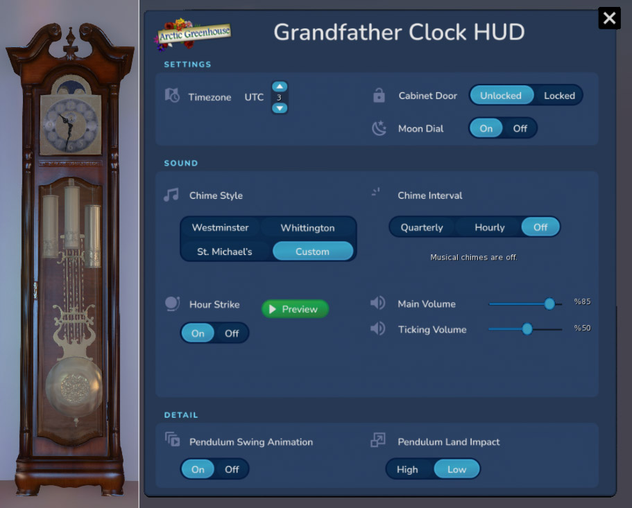
I've created 3D assets for many years across multiple platforms, and in this project for Arctic Greenhouse I wanted to both create both a realistic grandfather clock, and to also build out a solid interface to allow users to adjust things like the timezone and musical chimes.
Finished clock face, rendered in Maya
IDEATE
Intuitive Functionality VS Fun
Thinking outside of the box and coming up with novel ways to interact with 3D assets is of my favorite aspects about designing interfaces for VR, games, or virtual worlds. I started the interaction design by brainstorming different ways people would come across the clock and how to translate real-world interactions into something both fun and functional.
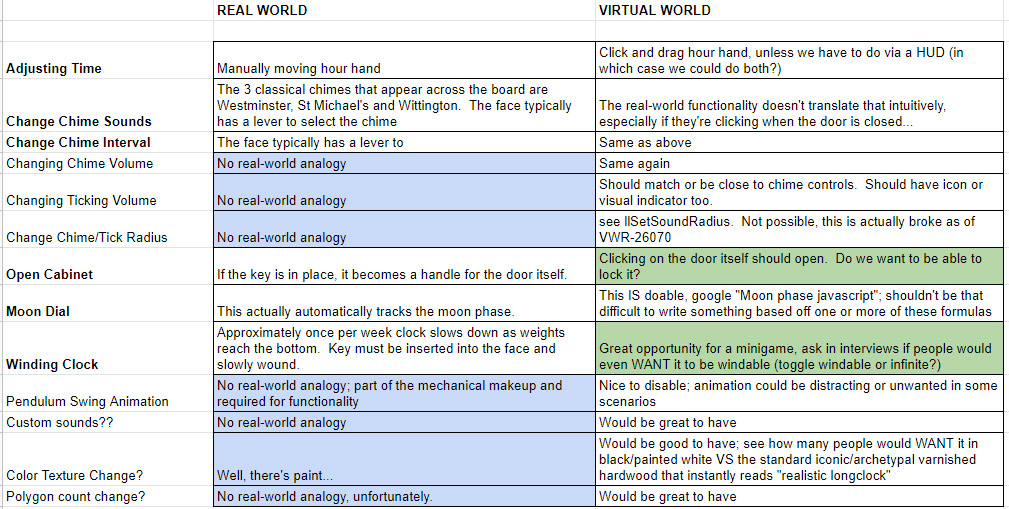
Typically, a grandfather clock has small control levers on the face itself to adjust which chime is selected, if the chime plays at all, and so on. However, these elements are understandably small as to not distract from the overall look of the clock face. Unless we specifically guide the camera to zoom in on these elements, this does not translate to a "fun" virtual experience and is less than ideal or intuitive.
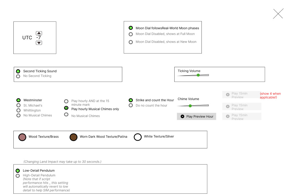
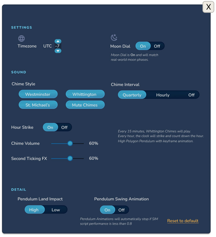
I mapped out all of the functionality that a real-world grandfather clock could have, and all of the functionality that I'd brainstormed for a virtual one. There were some "fun" ideas such as having a control panel appear inside the door once it was opened, or even on the back of the clock, and then zooming in the camera to these spots automatically. While these would have been novel and interesting ultimately it was more important that all of the functionality be intuitive right out of the box, so a HUD was going to be the best way to organize things as it leveraged methods that most people would know.
PROTOTYPE
Evolution of the Design
The original plan was to make this product parallel across many multiple platforms (The Unreal and Unity Marketplaces, Sketchfab, Turbosquid), however the HUD and full functionalty became exclusive to Virtual Worlds like Second Life and VR-Chat. Platforms such as Sketchfab, for example, only allow us to have a 3D object with standard animation and no sound. Meanwhile, someone could put this into the Unreal engine and then add whatever scripting would make sense for the context - at most they would want it to keep time, but the customization features became exclusive to Virtual Worlds and dependent on what that platform could offer.
TEST
Usability Testing and Lessons Learned
Most users were thrilled with the functionality of the HUD and immediately took to it. There were a handful of helpful initial suggestions such as being able to demo the HUD prior to purchase, and the ability to view and adjust resource usage. Clients were most impressed with the ability to dynamically change the pendulum animation method.
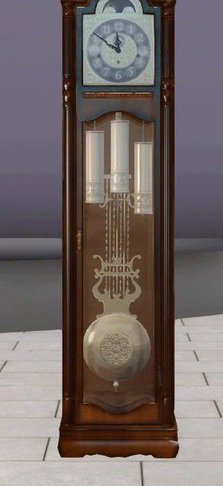
Figure I - Keyframe Animation with Detailed Polygon Model
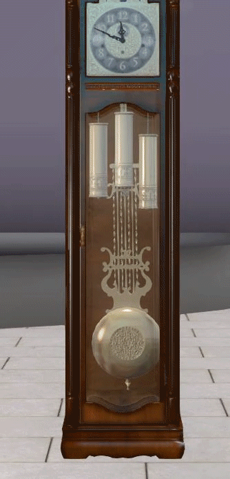
Technical limitations meant that there were two ways to make the pendulum sway back and forth. The first method was creating a high-polycount real representation of the pendulum that would be animated with just 6 keyframe positions (for performance concerns), as seen above. The second, as seen below, was to take a single flat image of the pendulum, but then rotate that texture smoothly back and forth. In the final version of the product users are empowered to choose either approach via the HUD.
Figure II - Texture Animation with Flat Pendulum Card
TESTING
Hands-on Prototype Testing with Endusers
Due to the nature of this product and the platform used, most of the user research and usability testing happened after the initial release. Surveys were sent out to the initial 50 customers, and further UX research will take place with later iterations of the product. Within virtual worlds it's much easier to rapidly prototype something and then push out updates or added functionality, and to find users willing and able to provide valuable feedback among the first set of customers.